
Luxury Living Room Color Palette: Neutrals + Accents

How do you choose a color palette for a luxury living room?
A luxury living room palette should feel intentional, layered, and calm—never flat or overly busy. Start by choosing one dominant neutral, then build depth with a secondary tone and one or two refined accents. The goal is a cohesive backdrop that makes high-end materials (stone, wood, velvet, brass) look richer and more dimensional.
1) Pick a “quiet” foundation neutral
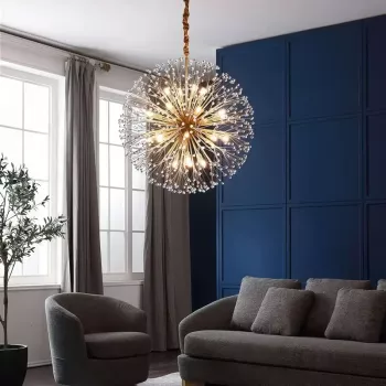
Choose a base that covers the largest surfaces: walls, large rugs, and main upholstery. Warm whites, soft greiges, taupes, and mushroom tones read especially luxe because they make the room feel bright while still grounded. For a more dramatic look, consider deep charcoal or inky navy as the foundation—just balance it with lighter textiles and reflective finishes.
2) Add a secondary color for depth
Your second color should be close in temperature to the base (warm with warm, cool with cool) and show up in medium-size elements like drapery, occasional chairs, or built-ins. Examples: camel with cream, slate with dove gray, or espresso with sand. This step is what prevents a neutral room from feeling one-note.
3) Choose one “jewelry” accent and repeat it sparingly
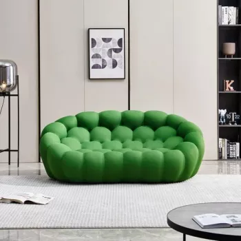
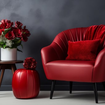
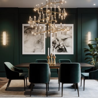
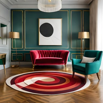
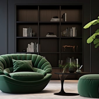
Luxury palettes often use restrained accents—think emerald, sapphire, oxblood, or aubergine—applied in smaller hits like pillows, art, and decor. Repeat the accent at least twice in the room so it feels curated, not random. Keep the number of accents limited to avoid a showroom-busy look.
4) Let materials and finishes do part of the coloring
Metal finishes, natural stone veining, and wood undertones count as colors. Decide whether the room leans warm (brass, walnut, travertine) or cool (nickel, ash wood, marble) and keep that direction consistent. A mixed-metal look can still be elevated—just choose one dominant metal and one supporting metal.
5) Test in real lighting before committing
Paint and fabric shift dramatically between daylight and evening lamps. View large swatches at different times, and check how the palette looks next to flooring and key furniture. A luxury scheme should feel balanced in both bright and low light.
For a full room-by-room approach to elevated styling, see the complete guide here: https://agathin.com/guide-luxury-living-room-styling-guide-steps-checklist/.
FAQ
What colors make a living room look expensive?
Layered neutrals (cream, taupe, greige, charcoal) look expensive because they highlight texture and quality materials. Add one restrained jewel-tone accent and consistent metal/wood undertones for a polished finish.











Leave a comment